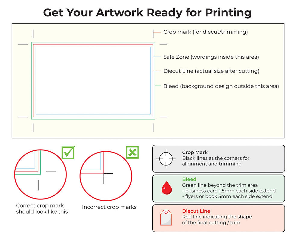
Minimum Thickness In Print
- William G.
- Jun 1
- 2 min read

⚠️ Minimum thickness in print → the rule every designer should know!
No matter what you're printing, there's one thing that can silently ruin your design before it even reaches the press:
Elements that are too thin.
Here's what to watch out for:
📌 Lines & strokes —: if they look delicate on screen, they'll likely disappear or break on print.
📌 Text —: the thinner and smaller, the harder it is to reproduce cleanly.
📌 Reversed-out text (white on dark) —: always needs more weight than you think to stay legible.
📌 Fine details —: intricate elements that look sharp digitally often fill in or get lost on press.
📌 Gaps between elements —: too close together and they risk merging into each other. 📌 Digital printing will look fine, but not for litho offset. Please choose the printing wisely
The tricky part -: Your screen lies to you. Everything looks crisp at 100% zoom.
But print is a physical process with real limitations — ink spreads, plates have tolerances, and what's invisible on screen becomes a problem on paper, fabric, or any other substrate.
✅ The golden rule:-
If you have to squint to see it on screen, it won't survive the press. Minimum stroke is 0.35pt. not 0.2pt If your fonts is 5pt and thin, the chances of it to turn out sharp or readable is 50:50. Min font typeface is 7pt or 8pt. Do not be too thin especially fonts with CMYK tones. If its black, make sure its K 100
When in doubt, make it thicker. And always check with your print supplier before sending your final file — every process has its own limits.
💬 Has a file ever come back looking completely different from what you expected? Let's talk about it! 👇


Comments